Project Overview
Role
UX/UI Designer (Full Project Lead)
Tools
Figma, Adobe Illustrator, Miro
Timeline
4 weeks
Goal
Create a seamless e-commerce platform for furniture discovery and purchase
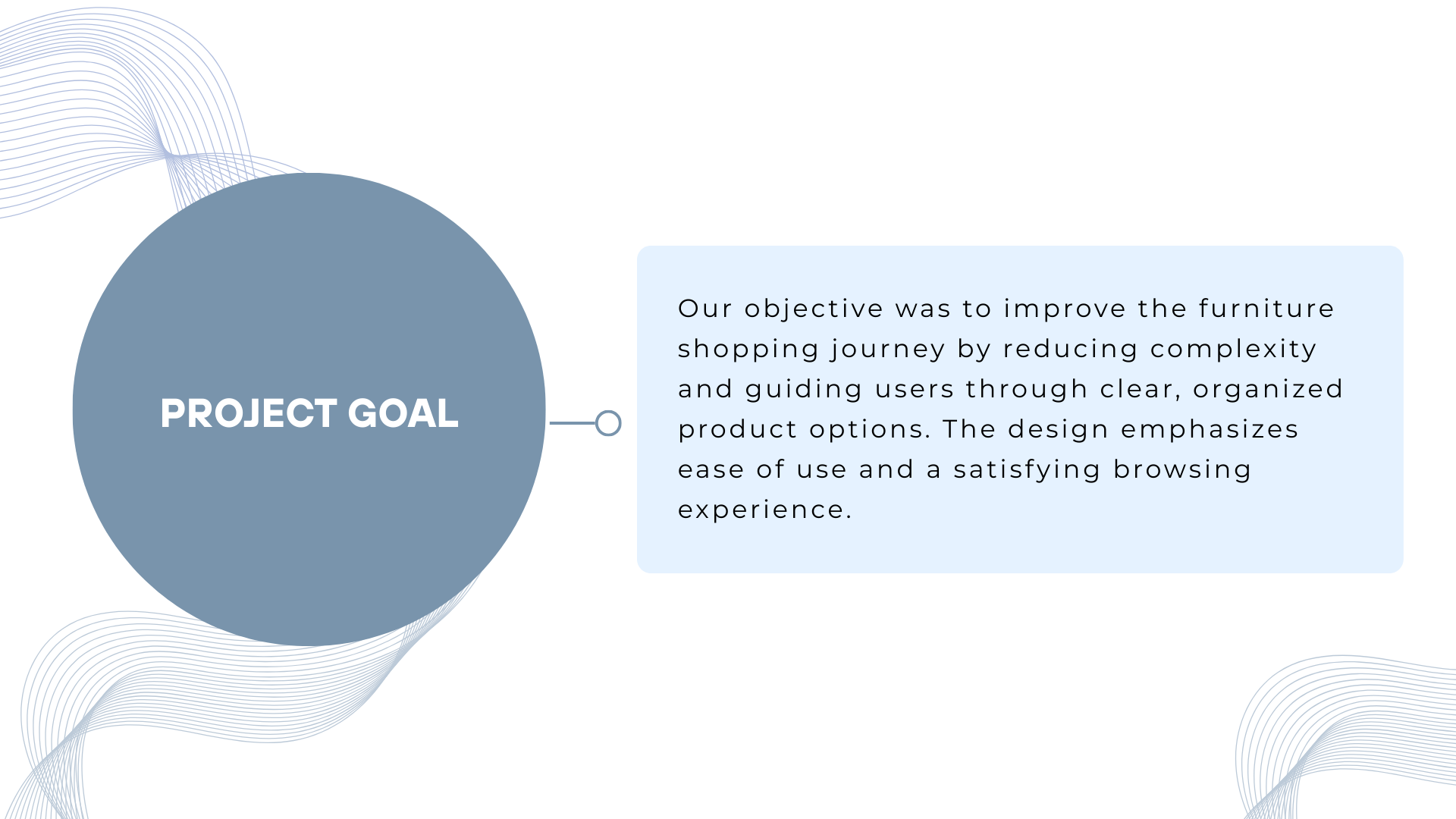
Designing an intuitive e-commerce platform that simplifies furniture shopping and increases conversion
UX/UI Designer (Full Project Lead)
Figma, Adobe Illustrator, Miro
4 weeks
Create a seamless e-commerce platform for furniture discovery and purchase
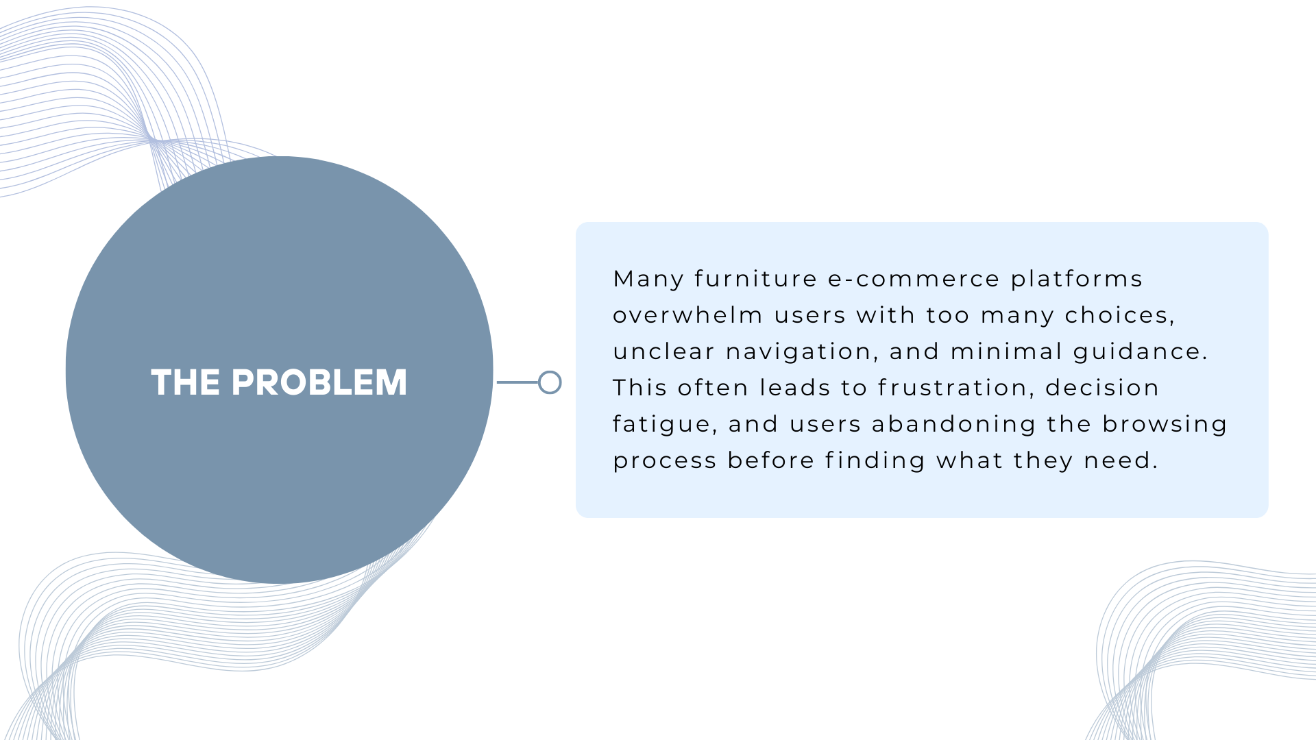
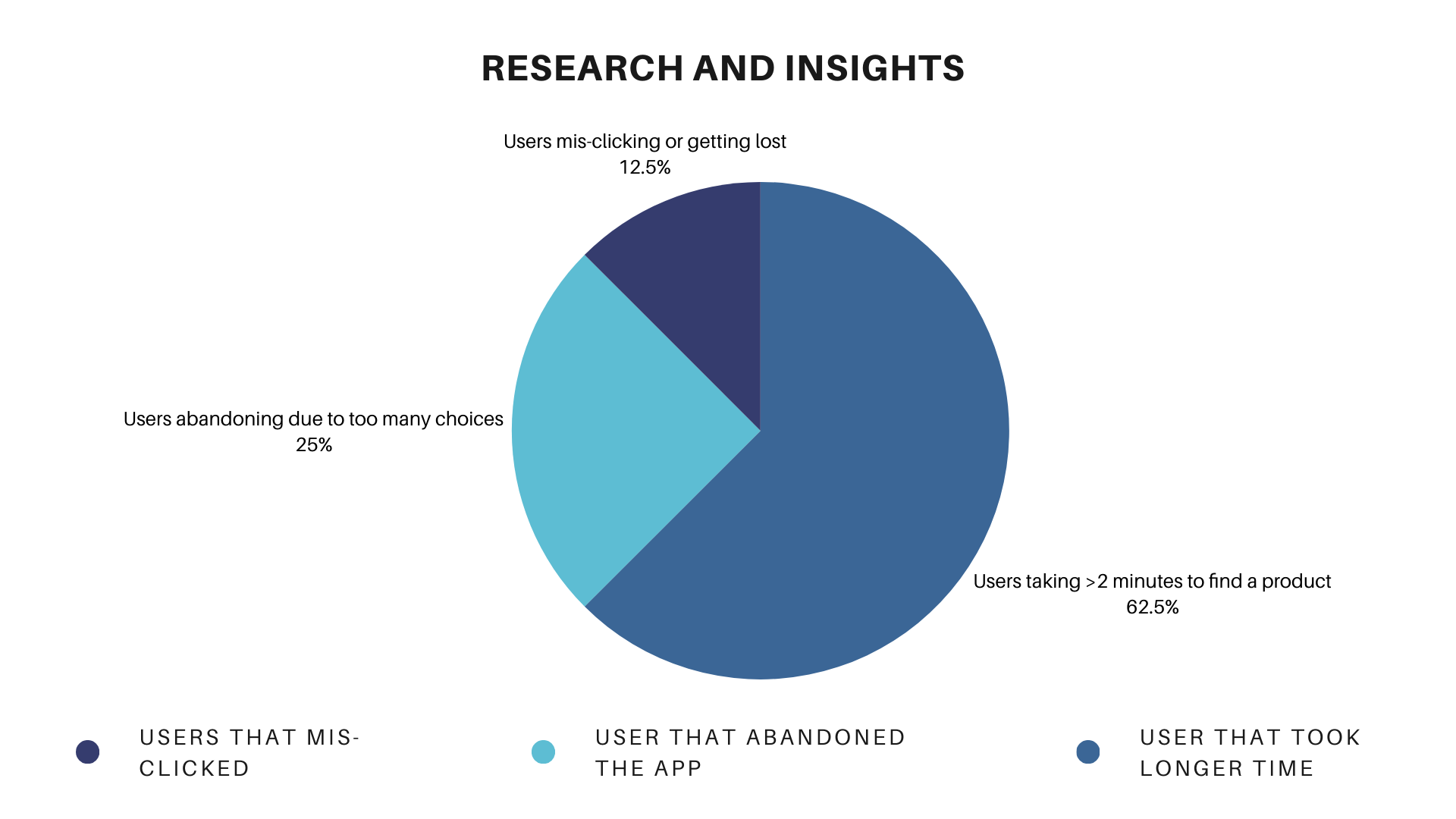
Customers were struggling with existing online furniture stores due to several critical pain points:
Overwhelming product catalogs with poor categorization made it difficult for users to find what they needed.
Lack of product filtering, comparison tools, and high-quality visuals reduced purchase confidence.
Complex checkout processes caused high cart abandonment rates.
Desktop-focused design left mobile users frustrated and unable to shop effectively.
Create a seamless digital shopping experience that guides users from discovery to purchase efficiently across all devices.
Studied top furniture e-commerce platforms to identify best practices
25 participants shared their online furniture shopping pain points
Tested existing competitors to identify UX improvements
✓ Users want clear categories and filters (type, material, price range)
✓ Product images and 360° views significantly increase purchase confidence
✓ Quick checkout options (guest checkout, saved addresses) are critical for conversion
✓ Mobile experience is equally important as desktop functionality
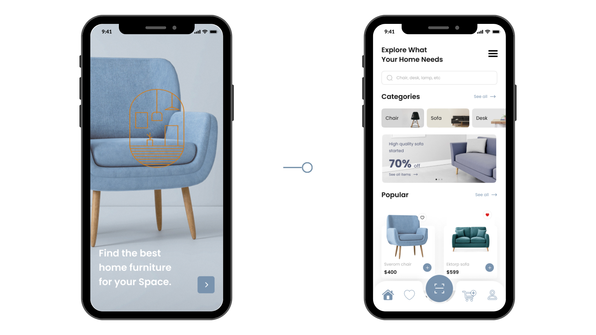
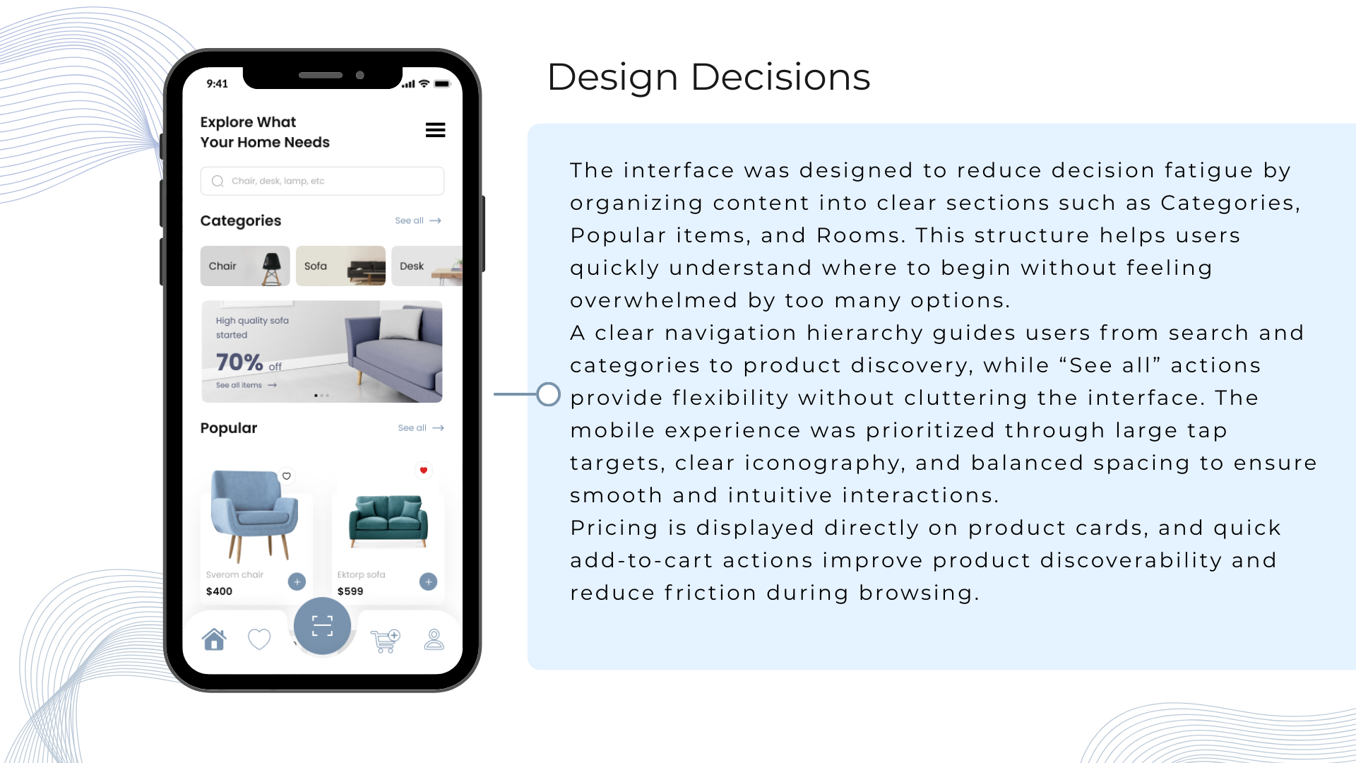
Moved filter sidebar to top bar for better mobile responsiveness and quick access on all devices.
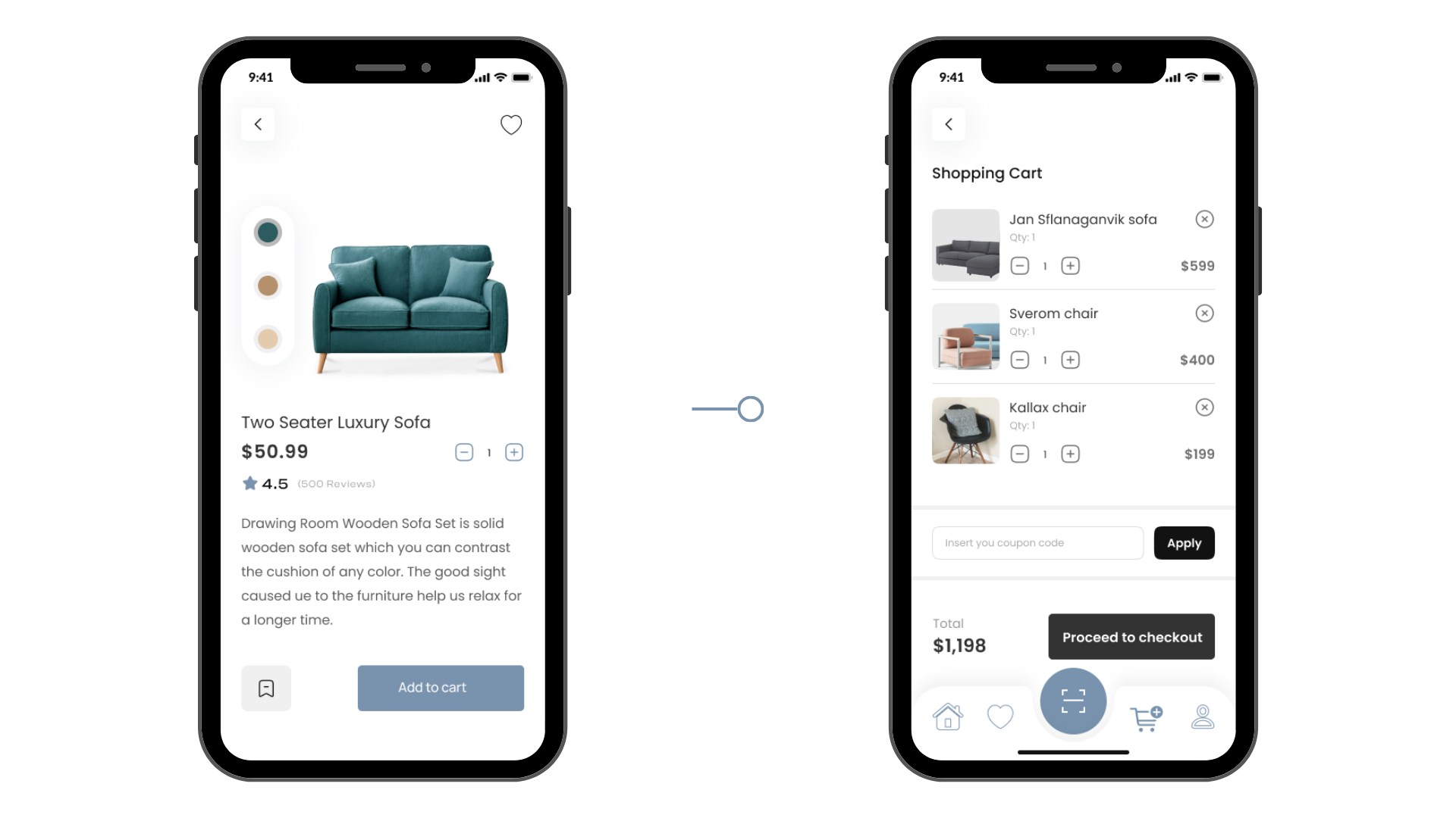
Added "Quick Add to Cart" button on product listings to reduce clicks and friction in the shopping process.
Cart icon always visible in navigation for easy access and clear product count display.
Designed for mobile first, then enhanced for desktop to ensure optimal experience on all screen sizes.
Earthy Neutrals + Accent Colors: Clean, calming palette that puts furniture products in focus while accent colors guide user actions.
Nunito (Body) | Playfair Display (Headers): Modern, readable fonts that balance sophistication with approachability.
Clear hierarchy using whitespace and sizing to guide users through the shopping journey naturally.
Unified component system across all pages ensures seamless, predictable user experience.
Featured categories, seasonal promotions, and intuitive search bar for easy product discovery.
Flexible filters, grid view, and product comparison option for informed purchasing decisions.
High-resolution images, 360° view, detailed specifications, and prominent "Add to Cart" CTA.
Step-by-step flow with progress bar, guest checkout option, and saved address shortcuts.
Clear navigation and improved product presentation boosted sales
Engaging homepage design kept users exploring the catalog
Mobile-first design successfully captured growing mobile users
Post-launch user testing revealed high satisfaction levels
Faster product discovery with improved filtering and navigation
Cart completion rate through simplified checkout process
Responsive design across all devices and screen sizes
Improved user confidence with 360° product views and high-quality imagery
Let's create something amazing together.